Archives For Design

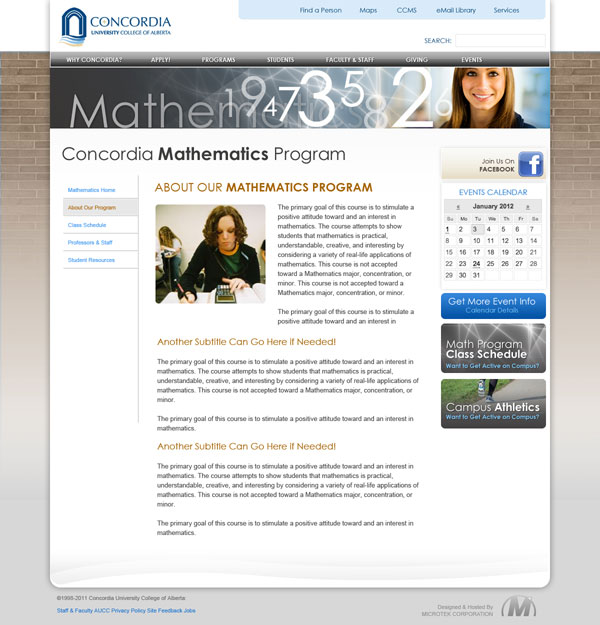
It looks like we are almost at the point of moving forward with a template look for our main page and secondary pages. The following main page image image incorporates the layout, colors and general feel of our main page. Remember the labels, headings and specific images etc. are items that we will be able to change and once we do some usability testing.

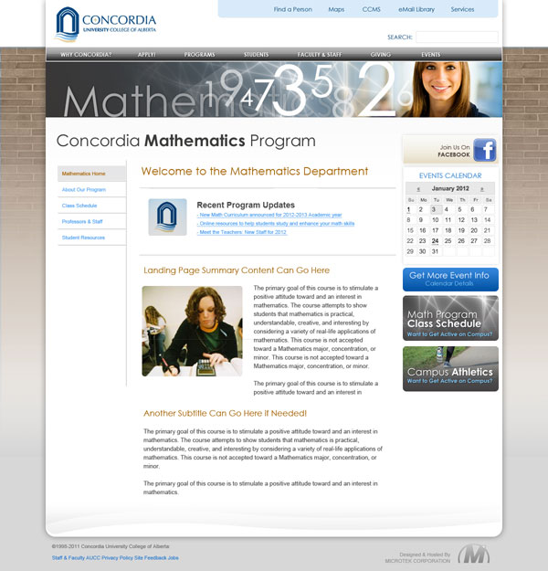
We have the following two variations of our secondary landing pages. The images can be replaced with an image that is appropriate for your area and we will be looking at how we can easily update these images and headers on a regular basis.

Rev 3a

Please use the following poll to select your secondary landing page preference. I also appreciate your comments.

[polldaddy poll=”5903469″]
The Inside Higher Education article No Laughing Matter discusses the Randall Monroe cartoon University Website which points to the unfortunate reality that much of what is on the first page of a University website isn’t what most people are looking for.

I think I will let this picture/cartoon do the talking…

Read the full article…

Standford’s dschool Environments Collaborative is unique space that evolved out of a unique idea.

Shaping Space: The d.school’s Environments Collaborative from Stanford d.school on Vimeo.

Luke Wrolewski a designer for Yahoo points Touch Gesture Reference Guide which is a unique set of resources for software designers and developers working on touch-based user interfaces. With the use of the iPhone Touch, and iPad and many other touch related devices growing these sorts of guides will become even more important to designers and ultimate users.