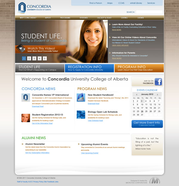
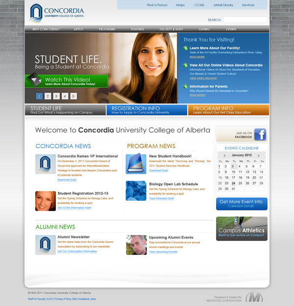
Please consider the wording for the sections of the site in the examples below as placeholders. We will be conducting user group testing to determine the best wording for the site. What we are looking to affirm is the general layout and look of the site.
[polldaddy poll=”5875034″]
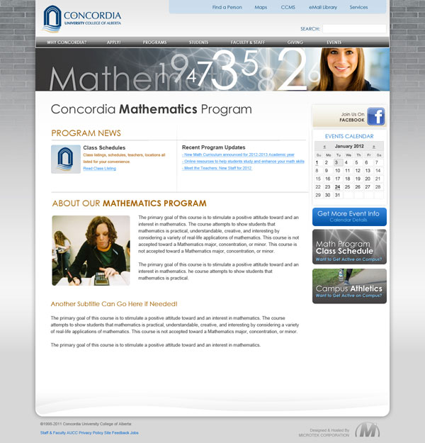
We are also looking for your comments on the Math Department Concept page:


prefer 2b, but with the colors of 2a for the top nav bar
as for the departmental concept, I’m wondering how much of the page appear initially on the screen. Also, I’m assuming anything below the calendar is cutomizable(that it does not necessarily have to be icons; that text links can also be added). Facebook link might be construed as a facebook group for the department.
Regarding the comments on the size of the banner on the department page: One should remember that one usually only sees the top half of each page , users need to scroll to the bottom half. If the banner wee much larger, there would be little information visible initially.
Just a note: the differences between the two revisions are that on (a) the three mid nav buttons are larger, the main menu bar is copper/sand, and the icons on the lower news/story items are smaller.
For the sake of clarity to the user, I really prefer (a). It’s not as blocky.
We’ve also asked the designer to rough in a left-side menu bar to allow for sub-navigation within a department website.
The designer and a couple of other people from MicroTek will be joining us for our meeting on Monday.
On the whole I’m quite happy to see the progress from what the website used to be and from the minimalist version we currently have.
I would avoid using exclamation marks, esp. in 2B, where it exclaims “Thank you for visiting!” and then immediately adds, “Learn more about our facility!” When you add the message about “Our first class education” under the program info it comes across as a bit too eager, if not desperate. I would let people decide for themselves.
As for the math page, I’m wondering if each program can have it’s own bar with links, as we currently have in English.
Anyway, keep it up.
Originally voted for 2b but am being persuaded about the warmer colours of 2a. I’d suggest warming up the brick wallpaper to something closer to the vintage bricks we actually have on the old buildings — or take an actual photo, bleed it down from rich to faint. A certain amount of “tweed and brick” gives an academic atmosphere and we have the history to back it up.
I prefer revision 2a, though I have to agree with some other points that have been raised. I prefer the smaller buttons on 2b, however, I feel they would only work if the image and “newsfeed” were brought down and made larger. The main issue I see with 2b is that there is no real visual hierarchy of information which is essential to a successful website. I do agree with Mark about the image and the look of the site as a whole; it definitely gives the impression of a more vocational or technical college. I believe this is in part due to the combination of colors and image, but also the effect of the menu bars and big buttons. I like the layout on the math page, though I would still prefer a slightly larger banner to anchor the page a little better. Overall, a defnite improvement from the previous options!
I prefer 2A because the colours are more easier on the eye (more subdued), complementing rather than competing visually with the text.
The comment about the buttons etc on 2b appealing more, and the colours in 2a being ‘softer’ makes good sense. Blue (thanks originally to Microsoft) is so common on template built web sites that to have a different softer colour gives more distinction and individuality to the web site.
I do hope Concordia will get away from having a picture of a pretty white woman on the front page. I associate this with vocational colleges advertizing on TV – if, as the President has reconfirmed yesterday, we are planning to become the best university in Edmonton, couldn’t we be more inventive and artistic in a front-page photo? Does a young woman with a book really attract potential students (or their parents)?
I feel that these revisions are much clearner, less cluttered, and easier to look at!
Home page: 2b colours are more “Concordian” than 2a, but 2a colours appeal to me (softer). LOVE the brick on the side; a reminder of our history. Under what tab would I (as a site visitor) find information about renting space at Concordia? Looking at this page, I would think under “Learn more about our facility” and/or Get More Event Info!
Math page: Like the consistency with the home page; would the Events Calendar just be “math” or “science division” events? If not, I think it’s redundant. I could see this space advertising the “Math Kangaroo” for example. I like Dr. Guelzow’s suggestion for a Math News ticker on the main page.
For the home page I prefer 2A but with the smaller version of buttons under the image as presented in 2B (student life, registration info, program info).
The vote for Revision A vs Revision B unfortunately does not contain a “Neither of the two” button.
First some comments about the Math department concept page:
If I look a the very basic layout only this would be fine (but it would also be difficult to image a site that wouldn’t be). Anything beyond that is really not acceptable: within the Math program, program changes happen only rarely, so the page as shown would essentially be unchanged for long periods of time. Web pages are much more useful if they encourage return visits through some changing content. The current Math web site tries to achieve this by including information about happenings in the World of Mathematics. There does not seem to be any space for that on this layout. The graphics is obviously designed by somebody without any understanding of Mathematics but that can clearly be changed. (Why would there be numbers on a Math web site, this is not the accounting department!?)