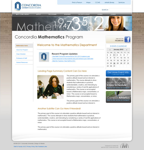
It looks like we are almost at the point of moving forward with a template look for our main page and secondary pages. The following main page image image incorporates the layout, colors and general feel of our main page. Remember the labels, headings and specific images etc. are items that we will be able to change and once we do some usability testing.

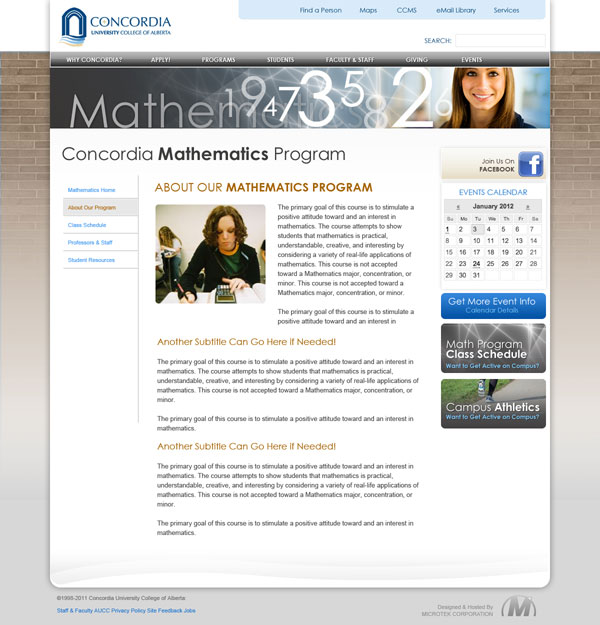
We have the following two variations of our secondary landing pages. The images can be replaced with an image that is appropriate for your area and we will be looking at how we can easily update these images and headers on a regular basis.
Please use the following poll to select your secondary landing page preference. I also appreciate your comments.
[polldaddy poll=”5903469″]


The second revision would be a better choice for Education. Because all of our students take their classes exclusively in our wing, we are able to regularly update our students about events through announcements, board notes, or through their indiviudal mailboxes. Thanks for the chance to share thoughts!
lIke the look and feel of all these. I wonder if departments could have the option to use either of the secondary formats? Like Scott, I really like the highlight feature of Recent Program Updates, and this will be a really helpful feature for us, and I am sure it would be for areas like Music, Drama, Athletics and others that have something noteable to mention that is time sensitive, while other departments may not and want a site they need to update less frequently – is the title of Recent Program Updates flexible to the needs of the department? Also, it would be helpful if the Math and Athletic buttons (in samples) on the secondary pages be related to links specific for the department….
I would go with both. It seems that the only difference is the “recent updates.” It would be ideal if this feature were an optional widget in the secondary page theme that departments can either turn on on or off. But if the goal is to have a consistent look and feel then I prefer not having it (b).
The left-hand local navigation menu is a great addition to departmental pages, and I really like it. However, my concern is that I don’t think it will work for the library. I would highly suggest using one of the other themes available to us, to be somewhat blank; by blank i mean the CSS file would dictate the style/look and feel/colour scheme without all the mandated content. This would not only benefit us in the library (who want to create our own main navigation structure because of the massive amounts of information we store) but it would allow Concordia to create custom/autonomous sites in the future as needed, which could be visually consistent but not necessarily need to fit in with the navigation structure of a main, secondary, or departmental page. For example the dicken’s day, and the Canadian Centre for Scholarship and the Christian Faith site are both run on a local install of wordpress with a custom theme these sorts of one-off sites could be created much easier if there was a “blank” (for lack of a better term) template available in the future.
Just a thought.
Dana
It would be great to have the flexibility to use the program updates for upcoming events as Mireille suggests. A way to link to our drama club activities would be an asset for Drama.
I agree with Andreas about the Campus Athletics and advertising links. I think that this should be able to be customized. As well, the second option has a cleaner look to it as mentioned by previous individuals.
Are these secondary landing sites intended for departments or for programs?
I agree with Alison. Program updates are not that common in most departments so this seems to be typically an empty or out-dated item. I am also wondering which items are fixed on the page and which ones are customizable. For example I have no idea what the “Math Program Class Schedule” leads to or what the “Athletics” advertising/link does on this page.
Our current departmental website presents News info from the world of Mathematics (and may so draw students to return to this site). I don’t see a place for that on these templates.
The second landing page looks less cluttered. I would like to see a button where we have the athletics button for the department/division. For example we can have a link to Science Club activities here.
Seeing as “someone” needs to be on top of updates at all times, I assume that each department will assign a staff member to regularly check the department’s page and make timely edits. This is the advantage of a template design; we do not need to go through the Web Master, we take responsibility for it ourselves.
I prefer the second landing page. I think it looks cleaner – and, as Sharlene points out the ‘recent program updates’ will look feeble if (a) it isn’t updated, or (b) there just aren’t many program updates. I can see (a) happening because of resource issues, and – at least in our department – (b) might happen because we don’t have program updates on a regular basis.
With respect to the main page, I think we’ve struck the right balance of providing intuitive access to information with an aesthetically pleasing layout. Given the malleability of the development platform, we should certainly move ahead with the knowledge that we will be able to fine tune the environment as we go.
With respect to the secondary pages, I really like the ‘highlights’ feature (in this case, “Recent Program Updates”) that is front and centre on the page.
I do like both lay-outs, but I don’t see too much difference between them. It goes without saying that the programs we offer are important, but in the School of Music (as I would expect Drama and Athletics) the events are equally as important. Instead of “Recent Program Updates”, I would put “Upcoming Events”. I assume we would have the flexibility to do that.
Like the “welcome” header for its tone.
Would like to see more brown/olive tones, the page is a bit too cool in its colours. Less greys and blues. E.g., the menu bars.
I like the Recent Program Updates because it would make the page “refresh-able” based on “current events” … the only problem with this is that Someone needs to be proactive is updating this … if it isn’t frequently updated, people will quit visiting.